Analyzer Charts Reference
Overview
The PredictionAnalyzer provides five chart types for visualizing model predictions and performance. All charts support flexible parameter configurations with automatic task-type detection.
Core Concepts
Metric Auto-Detection
When rank_metric or display_metric is not specified, charts automatically select:
Classification tasks:
balanced_accuracyRegression tasks:
rmse
The task type is determined from existing prediction data (not recomputed).
Parameter Naming Convention
Charts with ranking functionality use consistent parameter names:
rank_metric: Metric used to rank/select modelsrank_partition: Partition used for ranking (‘train’, ‘val’, ‘test’)display_metric: Metric shown in visualizations (defaults torank_metric)display_partition: Partition displayed in charts (defaults to ‘test’)
Charts without ranking (Histogram, Candlestick) use only:
display_metric: Metric to visualizedisplay_partition: Partition to display
Chart Types
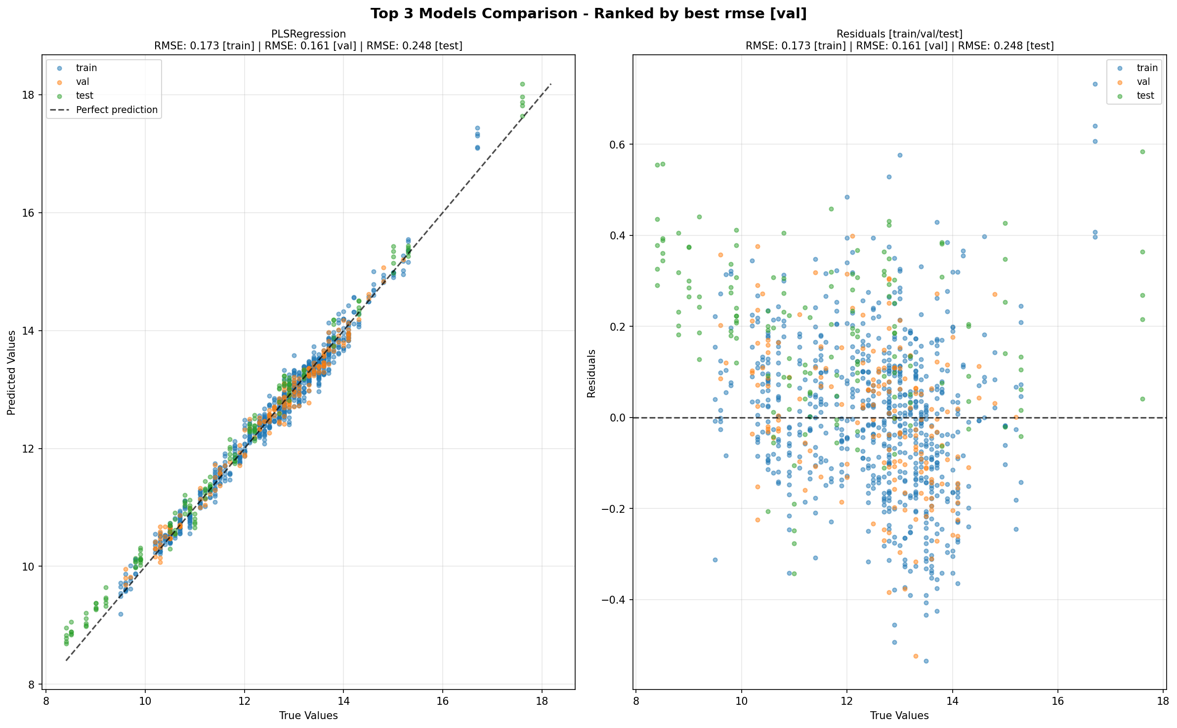
1. TopKComparisonChart (plot_top_k)
Purpose: Scatter plots showing predicted vs true values for top K models.
Signature:
plot_top_k(
    k: int = 5,
    rank_metric: str = None,          # Auto-detected
    rank_partition: str = 'val',
    display_metric: str = '',         # Defaults to rank_metric
    display_partition: str = 'all',   # 'all' or specific partition
    show_scores: bool = True,
    **kwargs
)
Key Features:
Shows predicted vs true scatter plots
Includes residual plots
Supports multiple partitions (‘all’ shows train/val/test)
show_scorescontrols score display in titles
Example:
# Basic usage (auto-detects metric)
fig = analyzer.plot_top_k(k=5)

# Explicit configuration
fig = analyzer.plot_top_k(
    k=3,
    rank_metric='rmse',
    rank_partition='val',
    display_partition='test'
)
Title Format:
Figure:
"Top {k} Models Comparison - Ranked by best {rank_metric} ({rank_partition})"Chart: Model name + ranking/display scores (controlled by
show_scores)
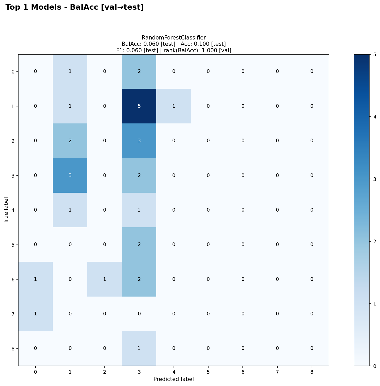
2. ConfusionMatrixChart (plot_confusion_matrix)
Purpose: Confusion matrices for top K classification models.
Signature:
plot_confusion_matrix(
    k: int = 5,
    rank_metric: str = None,          # Auto-detected
    rank_partition: str = 'val',
    display_metric: str = '',         # Defaults to rank_metric
    display_partition: str = 'test',
    show_scores: bool = True,
    **kwargs
)
Key Features:
Ranks models by classification metric
Shows confusion matrix from display_partition
Returns one figure per dataset
show_scorescontrols score display in titles
Example:
# Basic usage
fig = analyzer.plot_confusion_matrix(k=4)

# Explicit configuration
fig = analyzer.plot_confusion_matrix(
    k=3,
    rank_metric='accuracy',
    rank_partition='val',
    display_partition='test'
)
Title Format:
Figure:
"Dataset: {ds} - Top {k} Confusion Matrices\nRanked by best {rank_metric} ({rank_partition}), Displayed: {display_partition}"Chart: Model name + scores (controlled by
show_scores)
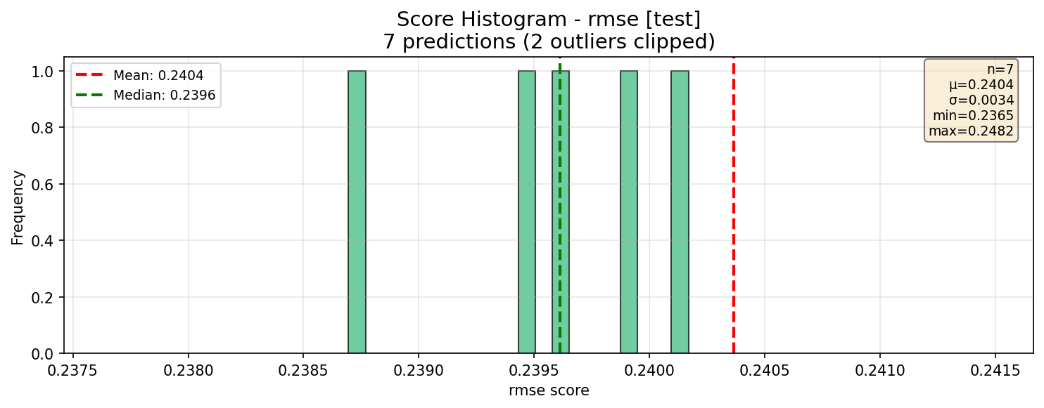
3. ScoreHistogramChart (plot_histogram)
Purpose: Distribution histogram of metric scores across predictions.
Signature:
plot_histogram(
    display_metric: str = None,       # Auto-detected
    display_partition: str = 'test',
    bins: int = 20,
    **kwargs
)
Key Features:
No ranking (displays all predictions)
Shows mean and median lines
Includes statistics box
Creates one figure per dataset when multiple datasets present
Example:
# Basic usage
fig = analyzer.plot_histogram()

# Explicit configuration
fig = analyzer.plot_histogram(
    display_metric='r2',
    display_partition='val',
    bins=30
)
Title Format:
"Score Histogram - {display_metric} ({display_partition})\n{n} predictions"
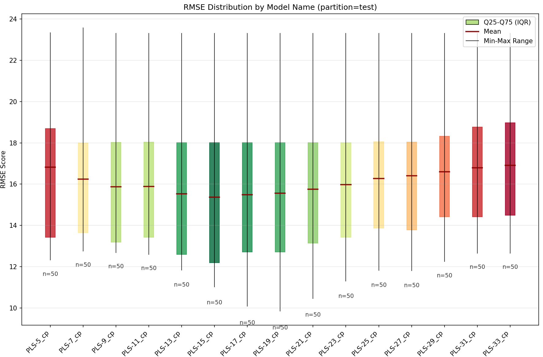
4. CandlestickChart (plot_candlestick)
Purpose: Box plots showing metric distribution grouped by a variable.
Signature:
plot_candlestick(
    variable: str,                    # Required: grouping variable
    display_metric: str = None,       # Auto-detected
    display_partition: str = 'test',
    **kwargs
)
Key Features:
Groups predictions by variable (e.g., ‘model_name’, ‘preprocessings’)
Shows min, Q25, mean, median, Q75, max
No ranking (displays all predictions)
Example:
# Basic usage
fig = analyzer.plot_candlestick(variable='model_name')

# Explicit configuration
fig = analyzer.plot_candlestick(
    variable='preprocessings',
    display_metric='rmse',
    display_partition='test'
)
Title Format:
"Candlestick - {display_metric} by {variable}\nDisplayed: {display_partition}"
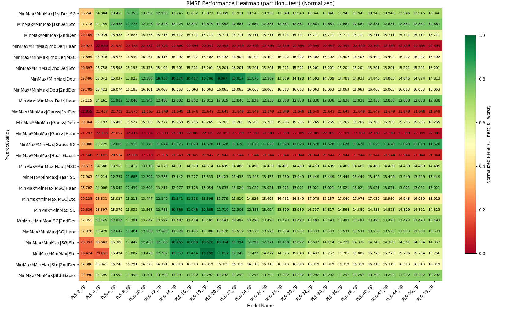
5. HeatmapChart (plot_heatmap)
Purpose: Performance heatmap across two categorical variables.
Signature:
plot_heatmap(
    x_var: str,                       # Required: x-axis variable
    y_var: str,                       # Required: y-axis variable
    rank_metric: str = None,          # Auto-detected
    rank_partition: str = 'val',
    display_metric: str = '',         # Defaults to rank_metric
    display_partition: str = 'test',
    normalize: bool = False,
    rank_agg: str = 'best',
    display_agg: str = 'mean',
    show_counts: bool = True,
    **kwargs
)
Key Features:
Ranks predictions using
rank_metric+rank_partition+rank_aggDisplays
display_metricfromdisplay_partitionusingdisplay_aggSupports multiple aggregation strategies (‘best’, ‘worst’, ‘mean’, ‘median’)
Colors based on normalized scores (always)
Can show raw or normalized scores in cells
Example:
# Basic usage
fig = analyzer.plot_heatmap('model_name', 'dataset_name')

# Advanced configuration
fig = analyzer.plot_heatmap(
    x_var='model_name',
    y_var='dataset_name',
    rank_metric='rmse',
    rank_partition='val',
    rank_agg='best',          # Select best model per cell
 display_metric=’r2’,
display_partition=’test’,
display_agg=’mean’, # Show mean R2 in cell
normalize=False,
show_counts=True
)
display_metric=’r2’,
display_partition=’test’,
display_agg=’mean’, # Show mean R2 in cell
normalize=False,
show_counts=True
)
**Title Format**:
- `"{display_agg} {display_metric} in {display_partition} (rank on {rank_agg} {rank_metric} in {rank_partition})"`

---

## Advanced Features

### show_scores Parameter (TopK & ConfusionMatrix only)

Controls score display in chart titles:

```python
# Default: show display_metric on display_partition
fig = analyzer.plot_top_k(k=5, show_scores=True)

# Show only ranking info
fig = analyzer.plot_top_k(k=5, show_scores='rank_only')

# No scores
fig = analyzer.plot_top_k(k=5, show_scores=False)

# Show display_metric on all partitions
fig = analyzer.plot_top_k(k=5, show_scores='all')

# Show multiple metrics on display_partition
fig = analyzer.plot_top_k(k=5, show_scores=['rmse', 'r2', 'mae'])

# Full control
fig = analyzer.plot_top_k(
    k=5,
    show_scores={
        'partitions': ['train', 'val', 'test'],
        'metrics': ['rmse', 'r2']
    }
)
Common Filters
All charts accept additional filters:
fig = analyzer.plot_top_k(
    k=5,
    dataset_name='wheat',      # Filter by dataset
    model_name='RandomForest', # Filter by model
    config_name='config1'      # Filter by config
)
Migration Guide
From Old to New Parameter Names
Old Parameter |
New Parameter |
Chart |
|---|---|---|
|
|
ConfusionMatrix |
|
|
Histogram, Candlestick |
|
|
Histogram, Candlestick |
Backward Compatibility
Old parameter names still work but will be deprecated:
# Old style (still works)
fig = analyzer.plot_confusion_matrix(k=5, metric='accuracy')

# New style (recommended)
fig = analyzer.plot_confusion_matrix(k=5, rank_metric='accuracy')
Best Practices
Let auto-detection work: Omit
rank_metric/display_metricfor automatic task-type selectionUse rank_partition=’val’: Reserve test set for final evaluation
Show multiple datasets separately: When working with multiple datasets, the analyzer automatically creates one figure per dataset
Use show_scores wisely: Default (
True) is good for most cases; use'all'or dict for detailed analysisNormalize heatmaps per dataset: When comparing across datasets, use
normalize=Falsebut colors still show relative performance
Common Patterns
Classification Analysis
analyzer = PredictionAnalyzer(predictions)

# Top models (auto-detects balanced_accuracy)
fig1 = analyzer.plot_top_k(k=5)

# Confusion matrices
fig2 = analyzer.plot_confusion_matrix(k=3)

# Performance across models
fig3 = analyzer.plot_heatmap('model_name', 'dataset_name')
Regression Analysis
analyzer = PredictionAnalyzer(predictions)

# Top models (auto-detects rmse)
fig1 = analyzer.plot_top_k(k=5, show_scores='all')

# Score distribution
fig2 = analyzer.plot_histogram()

# Model comparison
fig3 = analyzer.plot_candlestick(variable='model_name')

# Performance heatmap
fig4 = analyzer.plot_heatmap(
    'model_name',
    'dataset_name',
    display_metric='r2'
)
Multi-Metric Analysis
# Show RMSE for ranking, R2 for display
fig = analyzer.plot_top_k(
    k=5,
    rank_metric='rmse',
    display_metric='r2',
    show_scores=['rmse', 'r2', 'mae']
)