Pipeline Diagram
Visualize your pipeline structure as a directed acyclic graph (DAG).
Overview
The PipelineDiagram class creates a visual representation of your pipeline execution, showing:
All pipeline steps with operator names
Dataset shapes at each step (samples × processings × features)
Branching and merging points
Model training steps
Cross-validation splitters
Best scores for model nodes
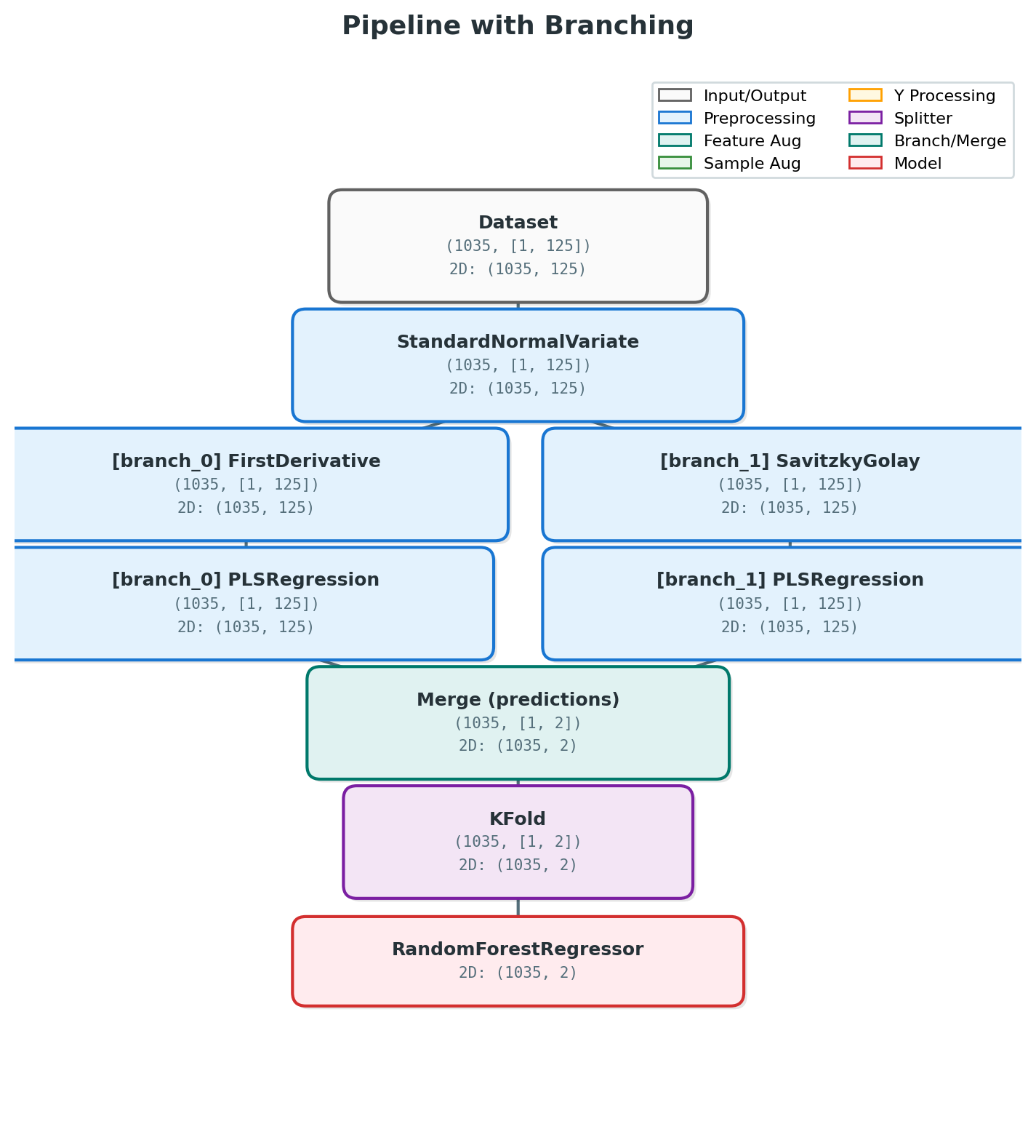
Pipeline Diagram with Branching Structure
Basic Usage
From Execution Trace
The recommended way to create a pipeline diagram is from an execution trace, which captures actual runtime shapes:
from nirs4all.visualization import PipelineDiagram

# Run your pipeline
result = nirs4all.run(pipeline, dataset, verbose=1)

# Get the execution trace
trace = result.execution_trace

# Create diagram from trace
diagram = PipelineDiagram.from_trace(trace, result.predictions)
fig = diagram.render(title="My Pipeline Structure")
fig.savefig("pipeline_diagram.png", dpi=150, bbox_inches='tight')
From Pipeline Definition
You can also create a diagram from a pipeline definition (without runtime shapes):
from nirs4all.visualization import PipelineDiagram

pipeline = [
    MinMaxScaler(),
    SNV(),
    ShuffleSplit(n_splits=5),
    {"model": PLSRegression(n_components=10)}
]

diagram = PipelineDiagram(pipeline_steps=pipeline)
fig = diagram.render(initial_shape=(100, 1, 500))
Shape Notation
The diagram uses S×P×F notation to show dataset dimensions:
S = samples (number of observations)
P = processings (preprocessing views/augmentations)
F = features (wavelengths/columns)
For example, (100, [1, 500]) means:
100 samples
1 processing view
500 features
Multi-source datasets show shapes for each source:
(100, [1, 500], [1, 200])= 100 samples, two sources with 500 and 200 features
Node Types and Colors
Node Type |
Color |
Description |
|---|---|---|
Input |
Gray |
Dataset entry point |
Preprocessing |
Blue |
Scalers, transformers, derivatives |
Feature Augmentation |
Teal |
Feature generation (SNV, Detrend, etc.) |
Sample Augmentation |
Green |
Data augmentation |
Y Processing |
Amber |
Target transformation |
Splitter |
Purple |
Cross-validation splitters |
Branch |
Teal |
Branch entry points |
Merge |
Teal |
Branch merge points |
Model |
Red |
Model training (shows best score) |
Configuration Options
Customize the diagram appearance:
config = {
    'figsize': (14, 10),      # Figure size
    'fontsize': 10,           # Base font size
    'node_width': 2.5,        # Node width
    'node_height': 0.8,       # Node height
    'show_shapes': True,      # Show shape info on nodes
    'compact': False,         # Use compact labels
}

diagram = PipelineDiagram(
    pipeline_steps=pipeline,
    config=config
)
fig = diagram.render()
Render Options
fig = diagram.render(
    show_shapes=True,         # Override config's show_shapes
    figsize=(16, 12),         # Override figure size
    title="My Pipeline",      # Custom title
    initial_shape=(100, 1, 500)  # Initial dataset shape
)
Branching Visualization
The diagram automatically handles branched pipelines:
pipeline = [
    MinMaxScaler(),
    {"branch": [
        [SNV(), PLSRegression(n_components=10)],
        [Detrend(), PLSRegression(n_components=8)],
        [FirstDerivative(), PLSRegression(n_components=12)],
    ]},
    {"merge": "predictions"},
    {"model": Ridge(), "name": "MetaModel"},
]
This creates a diagram showing:
Shared preprocessing (MinMaxScaler)
Three parallel branches (SNV, Detrend, FirstDerivative)
Merge node collecting predictions
Final meta-model
Source Branch Visualization
Multi-source datasets with per-source preprocessing:
pipeline = [
    {"source_branch": {
        "NIR": [SNV(), FirstDerivative()],
        "Raman": [MSC(), Detrend()],
    }},
    {"merge_sources": "concat"},
    PLSRegression(n_components=10),
]
The diagram shows separate branches for each data source.
Example Output
Here’s what a complex pipeline diagram looks like:
                    ┌─────────────┐
                    │   Dataset   │
                    │ (100,1,500) │
                    └──────┬──────┘
                           │
                    ┌──────▼──────┐
                    │ MinMaxScaler│
                    │ (100,1,500) │
                    └──────┬──────┘
                           │
                    ┌──────▼──────┐
                    │   Branch    │
                    └──────┬──────┘
           ┌───────────────┼───────────────┐
           │               │               │
    ┌──────▼──────┐ ┌──────▼──────┐ ┌──────▼──────┐
    │     SNV     │ │   Detrend   │ │ FirstDeriv  │
    └──────┬──────┘ └──────┬──────┘ └──────┬──────┘
           │               │               │
    ┌──────▼──────┐ ┌──────▼──────┐ ┌──────▼──────┐
    │    PLS_1    │ │    PLS_2    │ │    PLS_3    │
    │   ★ 0.85    │ │   ★ 0.82    │ │   ★ 0.88    │
    └──────┬──────┘ └──────┬──────┘ └──────┬──────┘
           │               │               │
           └───────────────┼───────────────┘
                           │
                    ┌──────▼──────┐
                    │    Merge    │
                    │(predictions)│
                    └──────┬──────┘
                           │
                    ┌──────▼──────┐
                    │  MetaModel  │
                    │   ★ 0.91    │
                    └─────────────┘
Using with PredictionAnalyzer
The PredictionAnalyzer also provides a branch diagram method:
from nirs4all.visualization import PredictionAnalyzer

analyzer = PredictionAnalyzer(predictions)
fig = analyzer.plot_branch_diagram(
    show_metrics=True,
    metric='rmse',
    partition='test'
)
Convenience Function
For quick visualization:
from nirs4all.visualization import plot_pipeline_diagram

fig = plot_pipeline_diagram(
    trace=execution_trace,
    predictions=predictions,
    show_shapes=True,
    title="My Pipeline"
)
Best Practices
Use execution traces: They provide accurate runtime shapes
Enable show_shapes: Helps understand data flow
Save high DPI: Use
dpi=150or higher for presentationsAdd titles: Descriptive titles help document experiments
Check model scores: The diagram shows best scores on model nodes
See Also
Analyzer Charts Reference - Prediction visualization
Pipeline Branching - Pipeline branching guide
Developer Guide - Architecture details